Experiential |
Experiential Design
|
|
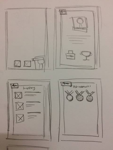
Now that the initial idea is there, i'd have to work on the details. First, I came up with a few sketches for the interface. And then I finalised on the colour and typefaces. I have decided to use the four main colours from the one I presented but also add a few shades of them, for shadows and highlights as I have an idea to use 3D pixel art as the art style for my application to make it "not so serious" as the game itself is already history themed. The final typefaces I used are Dopio one and Fabian, both a little blocky to match the pixel art style.
0 Comments
For this assignment, we were to come up with a few ideas for an unorthodox mobile application. First, we have to choose an available app that we think is a great example and I chose Dulingo. Below is my presentation slide. After that, I came up with a few choices of apps that I would prospose which are:
After presenting my ideas and cosultation, I have decided to work on the game idea. Then it was time to work on my prototype, but first I tweaked my logo to make it more interesting. Then I finalised my interface and made the promo video.
 Next thing to do was to work on the idea a do the preparations for presentation. These are my initial proposal and slides for the presentationn. Mr Sam asked me to reduce the colour pallete as it might be overwhelming. The name
I decided on the name "Second Wagon" because during a consultation, Mr Sam suggested that instead of making it just a game, I could make it educational. So I landed on the idea of the game being history themed, so players ca learn about history while playing the game even though they might not be consious about it. And being a history themed game, it has something to do with time travel and to incorporate that with the title, I used "second" like in time. The "wagon" is sort of a mean of transporation like how in Back To The Future they have the DeLorean. Also, second could mean "going back to the past a second time". Feedback from the presentation The typeface used might be a little hard to read for a mobile app. Reason I chose this typeface was to make it go with the history theme, an ink like typeface. I'll have to work on that. |